NHS EPR software must be intuitive and easy to use. Systems with high levels of usability save clinicians’ time and encourage safe care. But, features and functions are usually the focus of attention instead. Read on to find out what usability is, why it’s crucial in NHS settings, and what the three pillars of great usability are.
1. What is usability?
2. Why does the usability of NHS EPR software matter?
3. An NHS EPR usability survey
4. The three pillars of great usability
5. Realising the benefits of highly usable NHS EPR software
6. Next steps
What is usability?
We’ve all seen software that’s hard to use. It’s clunky. It gets in the way, and it’s frustrating because routine tasks take too long to complete. In a healthcare setting, there’s no excuse for poor usability because it can:
- impact patient safety
- waste valuable time, and
- create stress that contributes to clinician burnout.
In 2021-22 there were 19.6 million finished consultant episodes1 (FCEs) recorded in England’s hospitals. In December 2022 alone, there were more than 2.25 million A&E attendances in England2, an increase of 21.8 per cent compared to December 2021. These statistics show the volume of patient data that is added into EPR systems and then used to care for patients safely across the country. NHS EPR software must be easy to use with high levels of usability.
We believe that systems with good usability are safer and more efficient. As a result, clinicians spend less time battling with IT, which frees up time to care for their patients.
Usability describes how easy it is for you to complete tasks with speed and accuracy. Or, put another way, it’s how well the software lets you do what you want to do.
- Usable software is intuitive, so you know how to use it with minimal training or learning.
- Efficiency is an essential aspect of great software. That means removing unnecessary keystrokes, swipes, and mouse clicks to build simplicity.
- When software is well-designed, it’s a joy to use – the user experience is positive and satisfying.
Why does the usability of NHS EPR software matter?
There’s a relationship between usability and adoption. For example, how often have you downloaded an app on your phone and deleted it 30 seconds later because it’s hard to use? At worst, you’ve wasted a little time and a bit of money. But there are more severe consequences when EPR software has poor clinician adoption.
Every EPR project starts with ambitions to improve patient safety and be cost-effective. But poor adoption means clinicians revert to incumbent systems or paper. As a result, you won’t meet your patient safety improvements, your process efficiencies will not materialise, and therefore the business case for the EPR will fail to balance.
The first national acute EPR usability survey
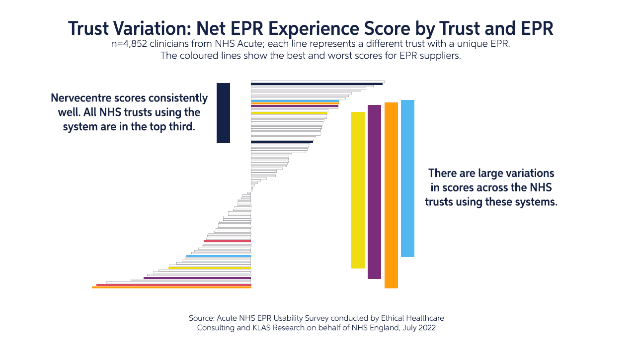
From December 2021 to May 2022, the NHS Transformation Directorate commissioned the first national acute EPR usability survey to understand how effectively clinical IT systems support frontline healthcare professionals across the NHS. The survey focused on acute care clinicians, with 147 trusts surveyed and 4,852 total responses.
The results have shown that Nervecentre’s next-generation EPR is used in four of the top eight trusts with the highest net usability score and has performed consistently higher than the NHS average in:
- reliability
- fast response time
- needed functionality
- and internal integration
Nervecentre’s success reflects its clinician-designed system, rapid response time, the breadth of its functionality, and collaborative partnerships with trusts.
An NHS EPR usability survey
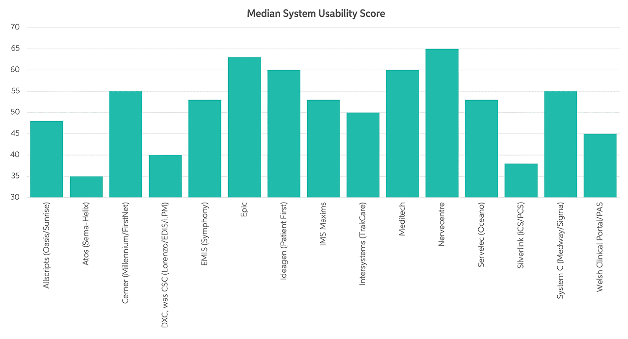
A survey of more than 1,600 emergency care professionals suggests that good NHS EPR usability can benefit a hospital’s clinical, patient flow, and financial functions. It may actively prevent patient harm too by enforcing clinical safety systems.
The study included median system usability scores by system3. We’re pleased to see that Nervecentre ranks in top place in the survey:
The three pillars of great EPR usability
There are many characteristics of highly usable NHS EPR software. However, the critical aspects that make a massive difference to the clinician’s experience, which then drives adoption, include:
1. Everything you need in one place
There are usability advantages when you use a single integrated and unified system, where everything is together in one place:
- You’ll have instant access to every aspect of the patient’s medical situation in one place. You can follow the patient pathway from start to end without jumping between systems. That’s a faster way of working that speeds up the treatment process.
- Knowledge gaps can occur when data falls through the cracks between systems, so clinical risks are lower when using one system, and patient records are complete and consistent.
- It’s much more convenient to log into a single system. There’s just one password to remember and one piece of software to learn to use, removing a significant source of frustration.
Care is faster, more efficient and safer when there is a single integrated EPR platform.
2. The real-time NHS EPR revolution
Real-time patient information
NHS EPR software needs to be lightning-fast with a rapid response. But more importantly, patient information must be up-to-the-second accurate, always. Clinicians struggle to trust data that’s hours, or even minutes, old. If the information isn’t a complete and precise view of the patient’s status right now, then it’s out of date. So real-time patient information is a must-have.
Live, real-time patient information creates a fundamental change in the basic concept of how clinicians use EPRs. Instead of being a place to record and transcribe the narrative of care, the EPR becomes something you cannot live without. It supports you ‘in the moment’. It helps you so much that you become dependent on it.
There are a couple of details worth mentioning that relate to real-time data. First, you don’t want to find out you can’t access a record because someone else is accessing it, and you don’t want to have to refresh to see what has changed in the time you’ve been looking at a page.
Isn’t it better when systems update in real-time? We think this is essential, especially when more than one person can be updating records simultaneously. For example, if you’re looking at a diagnosis and someone else changes it, you need to know this fact straight away. Otherwise, there may be a risk to patient safety.
EPR mobility
For doctors and nurses to rely on real-time patient records, it’s important to add information as soon as it’s known. Often, that means updating records at the patient’s bedside, which can be easy with mobile devices. It’s no hassle for clinicians to carry a smartphone, and they’re easy to use, too – but only when the EPR app is good (when it has a high level of usability).
Shoe-horning desktop software into a phone app doesn’t work well. Instead, a mobile-first approach is much better. It’s a design philosophy that strives for the best possible user experience on small screens. The basic principles include:
- Putting the appropriate information in a single view, such as seeing a patient’s blood pressure when prescribing ramipril.
- Building in simplicity (which is much harder than it sounds).
- Making sure the app responds quickly.
When you update the EPR while you’re with the patient, there are no paper notes to transcribe later. That saves time and reduces the risk of introducing errors or not adding the information at all.
The need for real-time data comes from management too. For example, hospitals can optimise how they run a department or ward using the latest data on patient acuity, bed occupancy, and staffing:
“Our Operations Centre has transitioned from chaos to calm. We now have three dashboards that give us an overview of the hospital. We have a view of what’s going on in the hospital at any one time from that room. This gives us a total visibility that we never previously had.”
Miriam Duffy, Director of Operations at Nottingham University Hospitals NHS Trust
3. Collaborative working
This last point pulls everything else together. The NHS is a collection of organisations that provide various healthcare services. It’s not too long ago that each NHS organisation maintained its own island of patient data. Now, interoperable systems talk to each other. As a result, it’s more common for clinicians and carers to see appropriate data from different parts of the NHS.
Showing a more holistic view of patients’ medical histories supports appropriate clinical decisions. That makes systems more usable.
Realising the benefits of highly usable NHS EPR software
Good usability meant that, in 2017, we could show a significant reduction in the time needed to complete an emergency department discharge summary. Using Nervecentre software, the amount of time fell from over seven minutes to an average of just one minute. That includes complying with emergency care dataset requirements too.
Earlier in this article, we quoted an NHS England statistic stating there were 1.5 million A&E attendances within one month. Taking six minutes away from each of those attendances would free up more than 20,000 working days a month across emergency departments in England!
Enabling this dramatic time saving ignites our motivation to innovate. We want to help more trusts provide safer and more efficient care.
Other recent innovations from Nervecentre include:
- ‘Scanning’ multi-page ambulance handovers using mobile phones and adding them to patient records straight away as PDF files
- Using cameras on smartphones for clinical photography, so any clinician can add images to a patient record instead of waiting for a dedicated clinical photographer to visit the ward
- Integration with GP Connect, the MIG, and referrals from NHS 111 to emergency departments
Next steps
The EPR usability survey is a significant first step towards improving NHS EPR software. However, we also need to measure the more profound impact of system usability. Less time on a PC means more time for patients.
How long it takes to prescribe medicines is measurable. How long it takes to administer is measurable. If a patient should start on a particular drug, how long before it’s in the prescription? Is it four hours? Or is it two minutes?
Making EPR software more usable is about refinement – progression, not perfection. As a result, systems can evolve and increasingly help doctors, nurses, and operational teams to get their work done quicker with better safety.
Our mindset is to design NHS EPR software on mobile devices that captures and shares real-time data ‘at the speed of thought’. Good usability gives healthcare professionals software that’s a pleasure to use and helps them prioritise the things they need to do. It means they can provide the best possible care:
“Everybody knows that the NHS needs to change, but you cannot do it without data. It has to be good data; clinically useful, highly accurate, relevant data. At NUH, we’re lucky – we’ve found a way to get our clinicians and nursing teams to capture that data at the patient’s bedside. We’re unlocking the power of information – and we’re using it to create change.”
Dr Mark Simmonds, Divisional Director for Medicine at Nottingham University Hospitals NHS Trust
Want to know more?
Here’s a podcast where our CEO and founder, Paul Volkaerts, discusses software usability in more detail.
References
- https://digital.nhs.uk/data-and-information/publications/statistical/hospital-admitted-patient-care-activity/2021-22#
- https://www.england.nhs.uk/statistics/wp-content/uploads/sites/2/2023/01/Statistical-commentary-December-2022-cftre1.pdf
- Bloom BM, Pott J, Thomas S, et al. Usability of electronic health record systems in UK EDs. Emergency Medicine Journal 2021; 38:410-415.
Updated 13 January 2023


