
Clinical Product Specialist Dr Sam Thacker explains how Nervecentre’s new Charting brings together hospital-wide real-time EPR data, and then graphs it to help clinicians understand their patients quickly.

Getting a proper understanding of a patient’s health can be tough, especially when clinicians have to mentally consolidate fragments of information from paper notes and unconnected digital systems. Working in this way makes it hard to understand the relationships between interventions and outcomes, to recognise trends, and ultimately to know if patients are getting better or worse. Nervecentre’s new Charting facility makes this easier.
The development and growth of Nervecentre into a broad EPR has created many opportunities for us to use real-time patient information to build data-driven hospitals. As a doctor, one of the more interesting and rewarding opportunities is our ability to create cross-sectional views of each patient’s care. We can bring together different threads of the data in patients’ records, such as investigations, observations, and medications, in one useful and usable place to give clinicians a better understanding of a patient’s physiology.
The problem with silos of information
When doctors refer to paper notes or use various modular digital systems, they face the same challenge: to mentally cross-index separate pieces of information into a layered and nuanced timeline. When you do that, it’s easy to make mistakes. You can misremember something. You can think something had a detrimental effect when it had a positive effect or vice versa. It’s really hard to understand what’s going on.
That’s where Charting comes in. It provides an understanding of how all the interventions that are recorded in Nervecentre affect a patient. We’re making people’s lives easier, which is, of course, a lot of what we do, by pulling together information from many sources without having to go hunting for it – and reducing the risk of errors. It’s all about seeing data against other data and analysing trends in one place, and knowing if your patient is getting better or worse.
What is Charting in Nervecentre?
Charting is a customisable framework that shows different aspects of data from a patient’s record alongside each other in one graph along a time axis to give clinicians better insight into the patient’s physiology and the cause and effect of their interventions on that physiology.
All this information you see on the chart is elsewhere in the EPR. It’s just taking it and presenting it in a different way.
A good example might be a patient who comes into ED Resus with type 2 respiratory failure. In that circumstance, the information you’re going to be gathering on the patient could include regular blood gases and observations of their oxygen saturation, fraction of inspired oxygen and respiratory rates. And you’ll be giving them broncho-dilating drugs like salbutamol and aminophylline. All of these interventions are going to have an effect on the patient’s physiology. Charting can graph your administration of drugs against the patient’s observations against the blood gases so you can see how one affects the others over time.
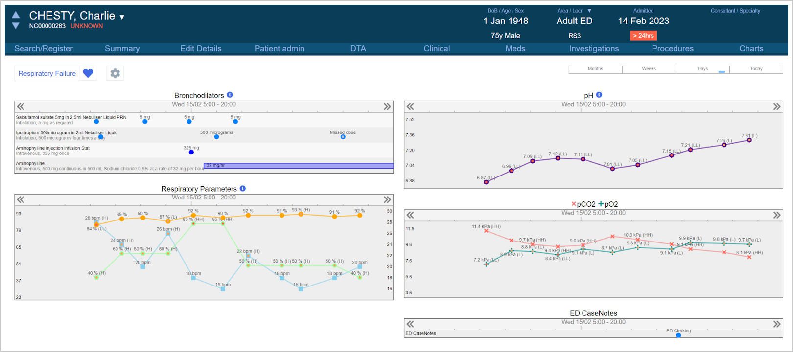
You can add and remove data items on-the-fly as you see fit. For instance, if you were to start that patient on non-invasive ventilation, you could add the relevant pressures to that chart in a couple of clicks without having to start another chart or change your view, or the chart might even add them automatically if it is configured to do so.
Charting use and usability
Just like the rest of Nervecentre’s EPR, great usability has been prioritised when designing Charting. We’ve put a huge effort into creating a flexible framework for gaining insight into a specific problem or condition for one patient over varying time periods. If you were looking after a patient who is on a long-term prescription or you’re monitoring renal function over a long period of time, you could have a really zoomed-out view covering several months. But if you’re looking after a patient in theatres or resus, you’re going to want a really zoomed-in view that shows minutes or hours, so we’ve got that ability to change the time frame you’re looking at very easily. These charts are scrollable, so it’s easy to look at earlier or more recent data.
Charts are divided into collections of data fields (that we call widgets) that can be manipulated and moved around, added and removed. It’s very easy to add a set of criteria to a chart you’re looking at, like the previous example of a patient on noninvasive ventilation – you want to add those criteria onto a chart you’re already using rather than switch to a different chart.
You get additional information whenever you’re hovering over a data point, so for example, if you added your Case Notes entries to the chart, you could hover over each one to see a summary of the content on the form, and a link that will take you straight to the relevant entry. All of these things are designed to make it easier to navigate and to get more detail when you need it rather than throwing all the detail in your face and cluttering up the screen – making it more intuitive and easier to use.
We recently added the ability to use multiple screens with Nervecentre. Charting is a great example of how powerful that setup can be. Typical scenarios for multi-screen working with Charting include:
- If you are on a ward that deals with a specific condition or on ITU, you could scroll through the patient list on one screen to view their ITU charts on the other.
- You could have two different charts open simultaneously, such as the respiratory specialist chart on one and the cardiovascular chart on the other, which would keep their timescales synchronised.
- You could view the clinical summary pages on one screen and the chart on another, giving you a simultaneous view both of ‘now’ and the recent past.
You can even use a chart as a jumping-off point, so if you see a patient is getting better with a specific medicine, you can click on that medicine in the chart to adjust the dose in EPMA.
Safety and better clinical insight
The big safety benefit that comes from Charting is physiological insight and particularly getting a better understanding between intervention x and variable y rather than having to try and work that out for yourself. A good example would be when a medication is causing a patient’s blood pressure to drop. You know the blood pressure is dropping, and you see that the medication is there, but you don’t normally see those things together. In Charting, you can see them overlaid on the same graph and understand the cause and effect.
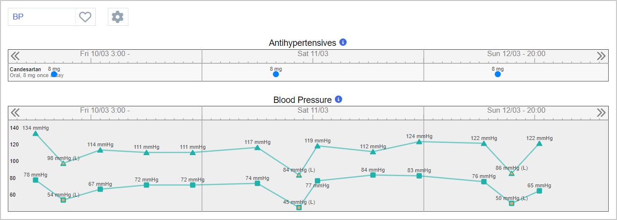
In this example, a significant drop in blood pressure is seen after the patient receives their Candesartan, which has been consistent over the past three days. This relationship can be seen a lot more easily, and it may be possible to deduce a link that may not have been so easy to recognise otherwise.
Next steps for Charting
Charting is a strategic addition to Nervecentre’s EPR. As it develops, it will serve as the basis for our ICU charting, anaesthetic charting, and medical emergency charting, but we are very excited to see all the use cases our customers will discover through the use of this flexible framework. There are quite a few angles to explore.
Our vision is to provide physiological insight that follows the patient through the hospital. For example, when the patient arrives in theatre the relevant data will be automatically captured by device integration with the monitor, ventilator, and drug pumps. All that information will go into the EPR so it can be displayed on charts. The anaesthetist can then review the chart, add any manual information they need to, review the automatic information and add any other drug administrations. This chart will continue either into recovery or intensive care and onwards to the ward, where the nurses can continue the patient’s care through the normal observations and EPMA functionality – but all the data that was on the chart is still in the patient’s database and available for review or decision support. Rather than the chart being a separate data repository, it is a single contiguous record that can inform the patient’s care going forward.
This forward-looking example is only possible when a trust is using a fully integrated EPR that has deep and broad functionality, such as Nervecentre.
Summary
Charting exploits one of the opportunities that has arisen as a result of Nervecentre evolving into a fully integrated EPR where everything is together in one place. There is a very clear need for EPRs to be much more than just a repository of patient information. They must also help clinicians to understand how they can best treat their patients. Charting unlocks the power of EPR data to provide the physiological insight clinicians need about their patients to improve care and reduce harm. Many suppliers focus on getting the data into digital systems. At Nervecentre, we’re good at getting the data out too.
Dr Sam Thacker
 Sam Thacker has been a Clinical Product Specialist at Nervecentre since September 2022. Prior to joining Nervecentre, he worked as a doctor for 8 years at several NHS trusts in the East Midlands region, most recently as a Junior Anaesthetist in Mansfield. He uses his expertise and clinical experience to assist the ongoing development of Nervecentre’s Critical Care and Theatres Management functionality and maintains a broad overview of clinician-facing features and usability considerations across the product.